Introduction to Brain Connectivity
Run this code: ⚡ In-browser lab · Colab · MATLAB Online
Overview
Most of the methods in earlier parts of this book produce univariate brain maps: at each voxel, we ask whether activity differs across task conditions or people. Those maps speak to functional specialization — what local neuronal populations encode. Brain connectivity addresses a complementary question about functional integration: how regions are organized into pathways and networks, and how they work together. This shift became dominant with the rise of resting-state fMRI (rs-fMRI), where there is no task and thus no predictors for a GLM — the relationships among regions themselves become the object of study. The units of analysis multiply accordingly: individual connections between nodes (voxels, surface vertices, or ROIs/“parcels”), pathways, components or “modes” with common sources, whole networks, and higher-order network characteristics can all be related to stimuli, behavior, and clinical status. This power comes with a cost: the number of possible connections grows with , where is the number of nodes, so connectivity analyses can dramatically increase the number of tests performed, and handling this multiplicity is a central concern.
“Connectivity” is an umbrella term, and it is standard to distinguish three flavors. Structural connectivity describes how regions are physically wired together by axonal fiber tracts, typically measured with diffusion-weighted MRI and tractography. Functional connectivity is defined as the undirected statistical association between two or more fMRI time series — it makes statements about the structure of relationships among regions without assuming a direction of influence. Effective connectivity is the directed influence of one region on the physiological activity recorded in another; it is inherently model-dependent and aims at causal claims.
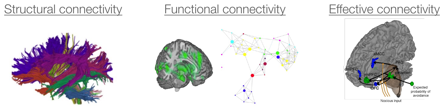
Three varieties of brain connectivity. Structural connectivity (left) describes physical wiring, here from diffusion MRI tractography. Functional connectivity (center) describes undirected statistical associations among regions, here as a graphical model. Effective connectivity (right) describes directed influences among a small set of regions, here from a dynamic causal model. (Figure 30.1 from the book. © the authors and MIT Press; reproduced with permission — not covered by this site’s CC-BY license.)
Designing a connectivity analysis means navigating a series of interlocking choices:
Data-driven or model-based? Exploratory decompositions (e.g., ICA) discover groupings and generate hypotheses; model-based approaches test a prior hypothesis.
Node definition and granularity. Voxels, atlas parcels, individually defined ROIs, or ICA components — and whether node activity is the regional mean, first eigenvariate, or a multivoxel pattern.
Whole brain or a subset of regions?
Level of analysis. Connectivity can be computed across time points, across single-trial response estimates, across subjects, or even across studies — each with a different interpretation.
Directed or undirected connections? Functional connectivity methods typically assume bidirectional associations; effective connectivity methods estimate directional influences.
Metric. Pearson correlation is the default, but partial correlation, Spearman/robust correlations, coherence, mutual information, and time-lagged measures each handle different threats.
Observed BOLD or latent neuronal activity? Most methods work on the measured signal; others (e.g., DCM) model the neuronal level plus neurovascular coupling.
Static or dynamic? Assume connectivity is constant across the run, or estimate time-varying connectivity.
Pairwise measures or network summaries? Graph-theoretic statistics (path length, centrality, and others) summarize higher-order structure.
Rest or task? A common connectivity “backbone” is conserved across states, but networks also reconfigure during tasks, and naturalistic paradigms may be more predictive of behavior.
The simplest functional connectivity analyses are built on bivariate correlations. In seed-based connectivity, one extracts the time series from an a-priori seed region and correlates it with every other voxel in the brain, producing a connectivity map per person that can enter group-level tests — for example, comparing task states or patient groups. Homologous regions such as left and right motor cortex can correlate remarkably strongly at rest (r ≈ 0.9 in Human Connectome Project (HCP) data), which is the empirical bedrock of the whole enterprise.
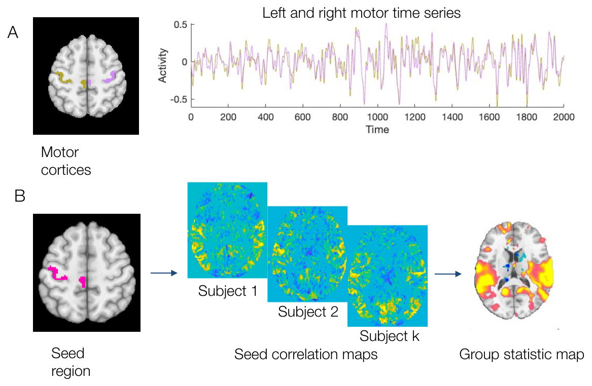
Two types of functional connectivity. (A) Resting-state time series from left and right motor cortex in one Human Connectome Project participant correlate very highly. (B) Seed connectivity: each voxel’s time series is correlated with a seed region (left motor cortex) in each subject, and the resulting maps are submitted to a group statistical test. (Figure 30.2 from the book. © the authors and MIT Press; reproduced with permission — not covered by this site’s CC-BY license.)
Generalizing from one seed to all pairs of nodes yields the functional connectome — a node-by-node connectivity matrix per person. Ordering the nodes by network membership reveals the block structure of resting-state networks (RSNs), such as the seventeen cortical networks identified by Yeo and colleagues from ~1,000 individuals. Connectomes support further analyses, from graph theory to connectome fingerprinting: identifying individuals by matching their connectome from one scan to another. Identification rates around 94% in HCP data demonstrate that correlation-based connectivity is stable and reliable enough to act as an individual signature.
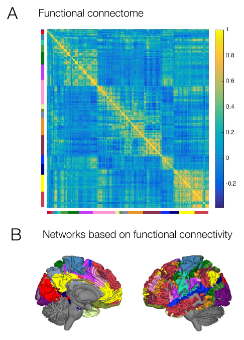
Functional connectomes. (A) Region-by-region correlation matrix spanning the cortex, with nodes grouped by functional network (colored bars). (B) Coherent functional networks identified from resting-state fMRI in approximately 1,000 individuals. (Figure 30.3 from the book. © the authors and MIT Press; reproduced with permission — not covered by this site’s CC-BY license.)
Bivariate correlation has a well-known Achilles heel: a third variable related to both time series can create an association where no direct relationship exists. The third variable may be another brain region — A and C may correlate only because both are connected to B — or a shared nuisance signal: head motion, respiration and cardiac cycles, and scanner drift all inject common variance into time series brain-wide, inflating functional connectivity estimates. Two complementary defenses are standard. First, nuisance regression: before computing correlations, remove motion estimates, ventricle and white-matter signals, and drift from every time series (with temporal filtering handled consistently with the regression), which is exactly what connectivity preprocessing pipelines do. Second, partial correlation, which measures the association between two variables controlling for others:
r_AB·C — partial correlation of regions A and B controlling for C · r_AB, r_AC, r_BC — pairwise Pearson correlations among the three time series
where is the partial correlation between regions A and B controlling for the third variable C (another region or a nuisance signal), and , , and are the pairwise Pearson correlations among the three time series.
Partial correlations become unstable as the number of controlled variables grows, and regularized inverse-covariance estimators are often used instead, generally outperforming full correlations. Vascular differences across regions pose yet another threat: time series can fail to line up even when neural activity does. Trial-level (“beta series”) connectivity — correlating single-trial GLM amplitude estimates rather than raw time series — mitigates inter-region differences in neurovascular coupling, at the cost of requiring a task design.
Effective connectivity methods make claims about directed, causal influences and are correspondingly model-dependent: researchers specify a small set of regions and connections a priori — motivated by anatomy and theory — and statistically compare a handful of alternative models. Structural equation modeling explains the variance–covariance structure of observed signals through path coefficients; dynamic causal modeling moves the model to the neuronal level, linking latent neuronal dynamics to the BOLD signal via neurovascular coupling and comparing hypotheses with Bayesian model selection; Granger causality skips the structural model and asks whether past values of one region improve prediction of another — informative about temporal precedence, but “causal” only in a limited sense. The trade is explicit: effective connectivity offers theoretically stronger inference than functional connectivity, but its conclusions are only as good as the specified model. Excluding a lurking variable — a region that belongs in the network but is left out of the model — can change both the strength and the direction of estimated connections. More fundamentally, the formal steps of causal inference (defining the causal estimand, and establishing that it is identified from the data collected) are usually missing, and unmeasured confounding can rarely be ruled out without direct manipulation of neural activity. Combining neuroimaging with brain stimulation, and designing studies with explicit causal estimands in mind, are promising routes toward connectivity claims that rest on fewer untestable assumptions.
Hands-on tutorial
In this tutorial you will build the core objects of functional connectivity analysis from simulated data, where the ground truth is known: a set of ROI time series with community (network) structure, a parcellated correlation matrix, and a demonstration that a shared nuisance signal inflates connectivity — and that regressing it out repairs the damage.
Step 1 — Simulate networked ROI time series and compute the FC matrix. Twelve ROIs belong to three networks of four; ROIs within a network share a slow latent signal.
% Simulate 12 ROIs in 3 networks (4 ROIs each), 240 volumes
rng(30);            % fix the random seed for reproducibility
n_t = 240;          % n_t = time points (volumes); ~8 min at TR = 2 s
n_net = 3;          % n_net = number of networks (communities)
roi_per = 4;        % roi_per = ROIs per network
n_roi = n_net * roi_per;   % total ROIs (12)

latent = randn(n_t, n_net);                      % one latent signal per network
for k = 1:6, latent = conv2(latent, ones(5,1)/5, 'same'); end   % make it slow
latent = zscore(latent);

Y = 0.8 * kron(latent, ones(1, roi_per)) + randn(n_t, n_roi);   % 0.8 = network-signal strength vs. unit noise

R = corr(Y);                                     % full correlation matrix
figure; imagesc(R, [-1 1]); axis square; colorbar
title('Parcellated functional connectivity');
xlabel('ROI'); ylabel('ROI');
import numpy as np
import matplotlib.pyplot as plt
from scipy.ndimage import uniform_filter1d
rng = np.random.default_rng(30) # fix the random seed for reproducibility
n_t, n_net, roi_per = 240, 3, 4 # n_t = volumes (~8 min at TR = 2 s); n_net = networks; roi_per = ROIs per network
n_roi = n_net * roi_per # total ROIs (12)
latent = rng.standard_normal((n_t, n_net)) # one latent signal per network
latent = uniform_filter1d(latent, 15, axis=0) # make it slow
latent = (latent - latent.mean(0)) / latent.std(0)
Y = 0.8 * np.repeat(latent, roi_per, axis=1) + rng.standard_normal((n_t, n_roi)) # 0.8 = network-signal strength vs. unit noise
R = np.corrcoef(Y.T) # full correlation matrix
plt.imshow(R, vmin=-1, vmax=1, cmap="RdBu_r")
plt.colorbar(label="r"); plt.title("Parcellated functional connectivity")
plt.xlabel("ROI"); plt.ylabel("ROI")Example output:
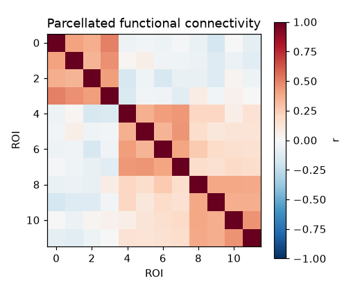
The 12 × 12 parcellated FC matrix: three bright within-network blocks along the diagonal, near-zero correlations elsewhere.
You should see three bright blocks on the diagonal — the network community structure — against near-zero between-network correlations.
Step 2 — Add a shared nuisance signal, watch FC inflate, then regress it out. A slow “respiration-like” signal added to every ROI mimics motion and physiological artifacts.
% Shared nuisance signal (e.g., respiration/slow motion) hits every ROI
g = zscore(conv(randn(n_t,1), ones(20,1)/20, 'same'));   % smooth over 20 volumes -> slow nuisance signal
Y_bad = Y + 1.2 * g * ones(1, n_roi);                    % 1.2 = artifact amplitude vs. unit noise

% Nuisance regression: residualize each ROI on [g, intercept]
% (on real data, see canlab_connectivity_preproc for the full pipeline)
Xn = [g, ones(n_t, 1)];
Y_clean = Y_bad - Xn * (Xn \ Y_bad);

off = ~eye(n_roi); r_off = @(M) mean(M(off));
fprintf('Mean off-diagonal r: true %.3f | contaminated %.3f | cleaned %.3f\n', ...
    r_off(corr(Y)), r_off(corr(Y_bad)), r_off(corr(Y_clean)));
# Shared nuisance signal (e.g., respiration/slow motion) hits every ROI
g = uniform_filter1d(rng.standard_normal(n_t), 20) # smooth over 20 volumes -> slow nuisance signal
g = (g - g.mean()) / g.std() # z-score the nuisance signal
Y_bad = Y + 1.2 * np.outer(g, np.ones(n_roi)) # 1.2 = artifact amplitude vs. unit noise
# Nuisance regression: residualize each ROI on [g, intercept]
Xn = np.column_stack([g, np.ones(n_t)])
beta, *_ = np.linalg.lstsq(Xn, Y_bad, rcond=None)
Y_clean = Y_bad - Xn @ beta
off = ~np.eye(n_roi, dtype=bool)
print(f"Mean off-diagonal r: true {np.corrcoef(Y.T)[off].mean():.3f} | "
f"contaminated {np.corrcoef(Y_bad.T)[off].mean():.3f} | "
f"cleaned {np.corrcoef(Y_clean.T)[off].mean():.3f}")Example output:
Mean off-diagonal r: true 0.123 | contaminated 0.533 | cleaned 0.130The contaminated matrix shows spuriously elevated correlations everywhere — including between networks that are truly unconnected — and nuisance regression restores estimates close to the truth. The full labs extend the arc: a seed correlation map over a simulated voxel grid, full vs. partial correlation in a chain network (why A and C can correlate without being directly connected), and a split-half reliability analysis showing how FC estimates stabilize with scan duration.
Open the full Python lab notebook → or download the MATLAB live script, which mirrors it and adds a real-data recipe using CANlab tools (canlab_connectivity_preproc, atlas-based ROI extraction, and seed regression).


Thought questions
A common connectivity “backbone” is conserved across rest and task, yet networks also reconfigure during task performance, and naturalistic connectivity may predict behavior better than rest. If you had 30 minutes of scan time per participant to study individual differences in attention, how would you split it between rest, task, and naturalistic paradigms — and what does your answer assume about what connectivity is?
You find that a patient group shows weaker seed connectivity between prefrontal cortex and striatum than controls. List at least three non-neural explanations for this difference — drawing on head motion, physiological noise, and regional differences in neurovascular coupling — and describe an analysis strategy (e.g., beta-series connectivity, nuisance regression choices) that addresses each.
With a 400-parcel atlas, a connectome contains nearly 80,000 unique edges, and graph theory adds many higher-order summaries on top. How do the choices described in this chapter (a priori regions, network-level summaries, model-based analysis) function as strategies for managing this multiplicity — and what do you give up with each one?
A shared nuisance signal inflates correlations brain-wide, which motivates regressing out the global mean signal. But the global signal also contains real, widely distributed neural activity, and removing it mathematically induces negative correlations. Make the best argument you can for and against global signal regression in a study comparing patients with different arousal levels to controls.
An effective connectivity model of three regions fits the data well and estimates a strong directed connection from A to B. A colleague objects that region D — anatomically connected to both — was omitted. Explain, using the concepts of lurking variables and unmeasured confounding, how this omission could reverse the conclusion, and what kind of experiment could make the causal claim more credible.
Quiz yourself
Q1. What are the three major varieties of brain connectivity, and which imaging technique is most associated with structural connectivity?
Answer: Structural connectivity (physical wiring by axonal fiber tracts, typically measured with diffusion MRI/tractography), functional connectivity (undirected statistical associations between fMRI time series), and effective connectivity (directed influences of one region on another, estimated from models).
Q2. How is functional connectivity formally defined, and how does it differ from effective connectivity?
Answer: Functional connectivity is the undirected association between two or more fMRI time series — a statement about the structure of relationships. Effective connectivity is the directed influence of one region on activity in another; it is model-dependent and aims at causal claims, whereas functional connectivity methods are largely data-driven and make no directional assumptions.
Q3. Describe the steps of a seed-based connectivity analysis.
Answer: Choose a seed region a priori, extract its (preprocessed) time series, correlate it with the time series of every other voxel in the brain to obtain a connectivity map per person, and then submit the maps to a group-level statistical analysis — for example, comparing task states or patient groups.
Q4. Why do connectivity analyses raise a multiplicity problem, and how does it scale with the number of nodes?
Answer: Every pair of nodes yields a potential connection, so the number of tests grows with for nodes (plus a large space of higher-order network measures). A whole-brain parcellation can produce tens of thousands of edges, so controlling for multiple comparisons — or reducing the space via a priori regions, components, or network summaries — is essential.
Q5. What does functional connectome fingerprinting measure, and what did it demonstrate about correlation-based connectivity?
Answer: Fingerprinting identifies individual subjects by matching the connectome estimated from one scan to the most similar connectome in a separate scan; the proportion of correct identifications is the statistic. Identification rates around 94% in Human Connectome Project data show that correlation-based functional connectomes are highly reliable, individual-specific signatures.
Q6. Why can standard Pearson correlations between two regions be misleading, and what metric addresses this?
Answer: A third variable — another brain region or a shared nuisance signal such as motion or respiration — can drive both time series, producing a correlation without any direct relationship. Partial correlation measures the association between two regions while controlling for other variables; with many nodes, regularized inverse-covariance estimators provide a more stable version.
Q7. What problem does trial-level (“beta series”) connectivity solve, and when can it be used?
Answer: Hemodynamics differ across brain regions for vascular reasons, so raw time series can disagree even when neural activity agrees. Correlating single-trial GLM amplitude estimates instead of raw time series minimizes these inter-region neurovascular coupling differences — but it requires a task design, since trials must be modeled.
Q8. Why is Granger causality described as “a bit of a misnomer,” and how does it differ from SEM and DCM?
Answer: Granger causality quantifies whether past values of one region improve prediction of another — temporal precedence — without specifying a structural model, but temporal precedence does not establish causality in the classical sense. SEM explains the covariance structure of observed signals through pre-specified directed paths, and DCM models latent neuronal dynamics linked to BOLD via neurovascular coupling, comparing candidate models with Bayesian model selection.
 The book: Elements of Functional Magnetic Resonance Imaging — Wager & Lindquist, MIT Press