Biomarkers and Translational Neuroscience
Run this code: ⚡ In-browser lab · Colab · MATLAB Online
Overview
Translational neuroimaging aims to map health-related signs, symptoms, and behaviors onto measures of brain structure and function — to understand the neurophysiological basis of clinical phenomena, to track or predict clinical outcomes, and to identify mechanistic brain targets for treatment. Biomarkers have transformed fields like oncology and cardiology, where they serve as intermediate endpoints and stratification tools in clinical trials. But most brain-related disorders — depression, anxiety, PTSD, chronic pain, substance use disorders — are still assessed mainly by self-report and clinical impression. Subjective reports are indispensable, yet they are poor indicators of underlying biological causes, limited by self-awareness and the ability to communicate, and hardest to obtain from the most vulnerable patients. The lack of objective biomarkers is widely recognized across NIH institutes as a critical gap, and clinical trials targeting self-reported outcomes have failed at increasing rates.
Population-level predictive models (Chapters 38–40) offer a path forward. A model trained to predict an outcome from brain images yields a precise “recipe” — a fixed set of weights — that can be applied prospectively to new individuals and new studies. Such models are called brain signatures (or neuromarkers). Two properties make them scientific assets: their predictive performance can be replicated on new samples, and their sensitivity and specificity can be evaluated against an open-ended set of related outcomes over time. Importantly, “signature” here names a class of model, not a claim of perfect uniqueness: many biomarkers in routine medical use (troponin for myocardial infarction, PSA for prostate cancer, HbA1c for diabetes) have modest sensitivity and reasonable specificity only in limited contexts. A model’s performance is an empirical matter, to be measured — not assumed from its name.
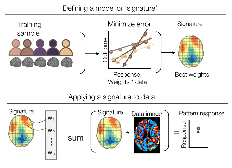
Brain signatures. (Top) A signature — the pattern of weights that best predicts the outcome of interest — is developed on training data. (Bottom) The fixed signature is then applied to new datasets: the weighted sum over each new image yields a pattern response, a single predicted value per person or condition. (Figure 41.1 from the book. © the authors and MIT Press; reproduced with permission — not covered by this site’s CC-BY license.)
Can this work in practice? The Neurologic Pain Signature (NPS) illustrates what rigorous prospective testing looks like. Trained to predict evoked pain intensity in one cohort, the NPS has since been applied — without re-fitting any parameters — to dozens of independent cohorts worldwide. In one test across 20 studies (N = 603), 95% of individuals showed a positive pain-related response, with an average effect size around . Tested for specificity on 18 further studies spanning pain, non-somatic negative emotion, and cognitive control, it discriminated pain from other states with sensitivity and specificity in the high 80s to low 90s — comparable to accepted biomarkers in other areas of medicine. Its boundary conditions are also becoming clear: it generalizes across body sites and stimulus types for brief evoked pain but does not capture tonic, ongoing pain. Mapping such boundary conditions — across variants of the construct, across contexts and scanners, and across populations — is itself an essential part of biomarker science.
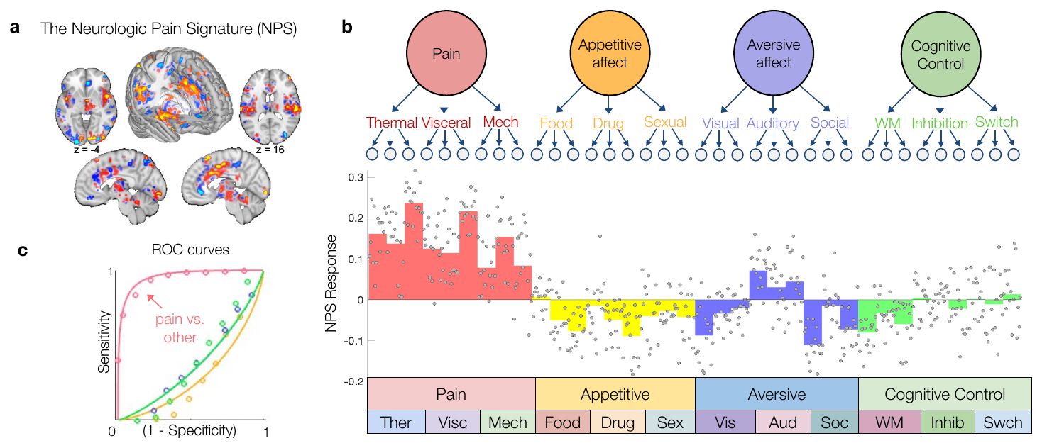
Validation of a neuroimaging signature across studies. (a) The Neurologic Pain Signature, a population-level model for evoked pain. (b) NPS responses in 36 studies not used in training (n = 540), spanning pain, appetitive affect, non-somatic aversive affect, and cognitive control. (c) ROC curves for classifying pain versus other domains; at a balanced threshold, sensitivity and specificity were each 87%. (Figure 41.2 from the book. © the authors and MIT Press; reproduced with permission — not covered by this site’s CC-BY license.)
The U.S. FDA distinguishes several biomarker types with distinct uses. A diagnostic biomarker indicates the presence of a condition; a predictive biomarker forecasts response to a specific treatment; together they can stratify patients into biologically defined subtypes (“biotypes”). A prognostic biomarker tracks future recurrence or progression in people who are already ill, while a susceptibility/risk marker identifies healthy individuals at elevated risk. Finally, a surrogate endpoint is a measure so strongly and consistently linked to disease (like blood pressure for cardiovascular outcomes) that it can substitute for a clinical outcome in trials — a status that requires a long progression of validation. Surveys of the translational neuroimaging literature show that most published models target diagnosis (patient vs. control classification), with accuracy high for neurological disorders such as Alzheimer’s and Parkinson’s (~90%) and more variable for mental health conditions. But only a small minority of models have ever been tested prospectively on independent data — and where they have, accuracy is often markedly lower than the cross-validated estimates from the development sample, a telltale sign of optimistic bias from flexible analysis choices, dataset-wide preprocessing, and model selection.
That bias has a precise statistical anatomy: the winner’s curse. When many tests are performed (voxels, regions, models) and the best results are selected — by significance thresholding or by picking the top performer — the selected effect sizes are inflated, sometimes drastically for small samples. A significant voxel in a small study must have a large observed effect by construction, because the significance threshold itself demands it, and chance contributes much of what pushed it over the line. The observed effect combines truth and luck; on replication the luck evaporates, and the effect shrinks toward its true value. This is why unbiased effect-size estimates require independent data, and why prospective testing with all parameters frozen is the cornerstone of biomarker validation. Five criteria summarize what a useful brain signature requires: a precise definition (shareable weights, applied without re-estimation), diagnosticity at the individual-person level (sensitivity and specificity against a defined set of alternatives), interpretability (knowing why a model works — the ADHD model that mostly indexed head motion is a cautionary tale), deployability (applicable to new people and settings with minimal complexity), and generalizability (holding up across individuals, scanners, and outcome variants).
Finally, clinical claims must be stated in clinically meaningful units, and a small set of conversions — exact under a normal, equal-variance model — connects the statistical and clinical worlds. If two groups are separated by standardized distance , classifying a single individual (single-interval classification) succeeds with probability
Acc_single — probability of correctly classifying one individual against a fixed cutoff · Φ — standard normal cumulative distribution function · d — standardized separation between group means (Cohen’s d)
where is the probability of correctly classifying a single individual against a fixed cutoff, the standard normal cumulative distribution function, and the standardized separation between the group means (Cohen’s ).
while a forced choice between one member of each group — which is also the area under the ROC curve — succeeds with probability
AUC — area under the ROC curve · Acc_forced — forced-choice accuracy: given one member of each group, pick which is the patient · Φ — standard normal CDF · d — standardized group separation
where is the area under the ROC curve, the probability of correctly picking the patient when shown one member of each group, and and are as above.
A “large” effect of thus yields only ~66% single-interval accuracy; 90% accuracy requires — brain–outcome associations of the size common in the mapping literature are far too weak for individual-level decisions. For treatment effects, the number needed to treat — how many patients must receive an intervention for one additional success relative to control — follows from and the control-group event rate (CER):
NNT — number needed to treat · EER — experimental (treated) group event rate · CER — control group event rate · Φ — standard normal CDF · Φ⁻¹ — its inverse (quantile function) · d — treatment effect size
where is the number of patients who must be treated for one additional success, and the event (response) rates in the treated and control groups, the standard normal CDF, its inverse, and the standardized treatment effect.
and a threshold-free variant (Kraemer & Kupfer) uses . And when a diagnostic test is deployed in a population, its usefulness depends on the base rate: the positive predictive value
PPV — probability that a positive test is a true positive · sens — sensitivity: P(test + | condition present) · spec — specificity: P(test − | condition absent) · prev — prevalence (base rate) of the condition in the tested population
where is the probability that a positive test is a true positive, the sensitivity (probability of a positive test given the condition), the specificity (probability of a negative test given no condition), and the prevalence of the condition in the tested population.
can be startlingly low for rare conditions — a test with 98% sensitivity and 98% specificity has a PPV of only 33% at 1% prevalence. Specificity and prevalence, more than sensitivity, determine whether a positive result means what patients and clinicians think it means. The tutorial and labs below turn each of these conversions into working code.
Hands-on tutorial
In this tutorial you will build the quantitative bridges between effect sizes and clinical performance metrics, then confront a realistic biomarker with base rates. The full labs add simulations that verify each formula empirically and demonstrate the winner’s curse.
Step 1 — Effect size to accuracy, AUC, and NNT. Under a normal, equal-variance model, all of these metrics are functions of alone (plus the control event rate, for NNT). We define the converters and plot accuracy as a function of .
% Adapted from CANlab FMRI_simulations (github.com/canlab)
% Converters: effect size d -> performance metrics
d2r        = @(d) d ./ sqrt(d.^2 + 4);          % point-biserial r
d2acc_forc = @(d) normcdf(d / sqrt(2));         % forced-choice acc = AUC
d2acc_sing = @(d) normcdf(d / 2);               % single-interval accuracy
d2nnt      = @(d, cer) 1 ./ (normcdf(d + norminv(cer)) - cer);  % Furukawa

d = 0:0.05:3;                                   % effect sizes to plot, 0 to 3
figure; hold on
plot(d, d2acc_forc(d), 'LineWidth', 3)
plot(d, d2acc_sing(d), 'LineWidth', 3)
plot([0 3], [.5 .5], 'k:', 'LineWidth', 2)
xlabel('Effect size (d)'); ylabel('Classification accuracy')
legend({'Forced choice (= AUC)' 'Single interval' 'Chance'}, ...
    'Location', 'southeast')

fprintf('d = 0.8: single-interval acc = %.1f%%, AUC = %.2f\n', ...
    100 * d2acc_sing(0.8), d2acc_forc(0.8))
fprintf('d for 90%% single-interval acc: %.2f\n', 2 * norminv(0.9))
fprintf('NNT at d = 0.5, CER = 0.5: %.1f\n', d2nnt(0.5, 0.5))
import numpy as np, matplotlib.pyplot as plt
from scipy.stats import norm
# Converters: effect size d -> performance metrics
d2r = lambda d: d / np.sqrt(d**2 + 4) # point-biserial r
d2acc_forc = lambda d: norm.cdf(d / np.sqrt(2)) # forced-choice acc = AUC
d2acc_sing = lambda d: norm.cdf(d / 2) # single-interval accuracy
d2nnt = lambda d, cer: 1 / (norm.cdf(d + norm.ppf(cer)) - cer) # Furukawa
d = np.arange(0, 3.01, 0.05) # effect sizes to plot, 0 to 3
plt.plot(d, d2acc_forc(d), lw=3, label="Forced choice (= AUC)")
plt.plot(d, d2acc_sing(d), lw=3, label="Single interval")
plt.axhline(0.5, ls=":", color="k", label="Chance")
plt.xlabel("Effect size (d)"); plt.ylabel("Classification accuracy")
plt.legend(loc="lower right")
print(f"d = 0.8: single-interval acc = {100*d2acc_sing(0.8):.1f}%, "
f"AUC = {d2acc_forc(0.8):.2f}")
print(f"d for 90% single-interval acc: {2*norm.ppf(0.9):.2f}")
print(f"NNT at d = 0.5, CER = 0.5: {d2nnt(0.5, 0.5):.1f}")Example output:
d = 0.8: single-interval acc = 65.5%, AUC = 0.71
d for 90% single-interval acc: 2.56
NNT at d = 0.5, CER = 0.5: 5.2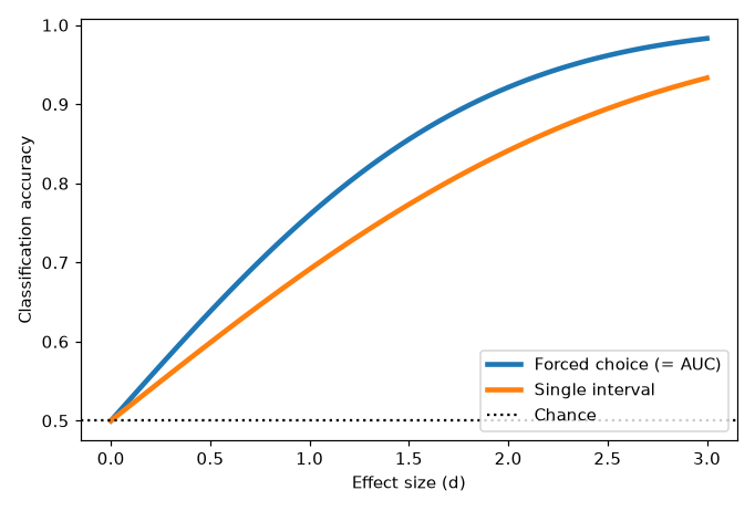
Accuracy as a function of effect size : forced choice (= AUC) always exceeds single-interval accuracy for the same , and both start at chance (0.5) when .
Step 2 — Base rates and positive predictive value. A biomarker’s sensitivity and specificity are fixed properties of the test, but PPV — the probability that a positive result is a true positive — depends on prevalence. We sweep prevalence for several specificity levels at 90% sensitivity.
% Adapted from CANlab FMRI_simulations: diagnostic_testing.m
calc_ppv = @(sens, spec, prev) sens .* prev ./ ...
    (sens .* prev + (1 - spec) .* (1 - prev));

prev = 0.001:0.001:0.5;                  % prevalence (base rate)
spec_vals = [.80 .90 .95 .98 .999];      % specificity levels to compare

figure; hold on
for i = 1:length(spec_vals)
    plot(prev, calc_ppv(.90, spec_vals(i), prev), 'LineWidth', 3)
end
xlabel('Prevalence'); ylabel('Positive predictive value (PPV)')
legend(cellstr(num2str(spec_vals', 'Spec = %.3f')), 'Location', 'southeast')
title('Sensitivity fixed at 90%')

% A "great" test can mislead for rare conditions:
fprintf('98/98 test at  1%% prevalence: PPV = %.2f\n', calc_ppv(.98, .98, .01))
fprintf('90/90 test at 20%% prevalence: PPV = %.2f\n', calc_ppv(.90, .90, .20))
def calc_ppv(sens, spec, prev):
return sens * prev / (sens * prev + (1 - spec) * (1 - prev))
prev = np.arange(0.001, 0.5, 0.001) # prevalence (base rate) to sweep
for spec in [0.80, 0.90, 0.95, 0.98, 0.999]: # specificity levels to compare
plt.plot(prev, calc_ppv(0.90, spec, prev), lw=3, label=f"Spec = {spec:.3f}")
plt.xlabel("Prevalence"); plt.ylabel("Positive predictive value (PPV)")
plt.legend(loc="lower right"); plt.title("Sensitivity fixed at 90%")
# A "great" test can mislead for rare conditions:
print(f"98/98 test at 1% prevalence: PPV = {calc_ppv(.98, .98, .01):.2f}")
print(f"90/90 test at 20% prevalence: PPV = {calc_ppv(.90, .90, .20):.2f}")Example output:
98/98 test at  1% prevalence: PPV = 0.33
90/90 test at 20% prevalence: PPV = 0.69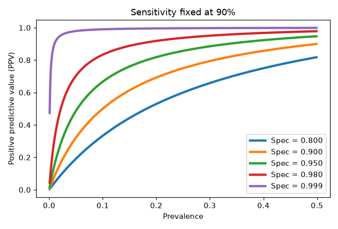
PPV as a function of prevalence at 90% sensitivity. At low prevalence, PPV collapses unless specificity approaches 99.9% — specificity and base rate, not sensitivity, determine what a positive test means.
The full labs extend both steps: they verify the accuracy and NNT formulas with direct simulation, map NNT as a function of and response threshold, simulate the winner’s curse — showing how significance-selected effect sizes from a small discovery sample shrink on replication — and work through a realistic chronic-pain biomarker scenario with PPV.
Open the full Python lab notebook → or download the MATLAB live script, which mirrors it using CANlab-style code.


Thought questions
The NPS predicts brief evoked pain with but does not generalize to tonic, ongoing pain. Is it a failed pain biomarker, a successful biomarker for a narrower construct, or something else? How should its boundary conditions shape the clinical claims that could legitimately be made for it — and which FDA biomarker categories could it plausibly fill?
A startup reports 95% accuracy classifying depression from resting-state fMRI in a sample of 40 patients and 40 controls. Using the concepts of winner’s curse, cross-validation leakage, model selection, and diagnostic reliability of the target label, list the distinct mechanisms that could inflate this number — and describe the minimal study that would convince you the accuracy is real.
Suppose a chronic-pain prognostic biomarker (predicting transition from acute to chronic pain) has sensitivity and specificity of 85% each. Work through how its practical value changes across deployment contexts — a specialty pain clinic where 40% of patients transition, versus population screening where 5% do — and what actions a positive test would need to trigger for the test to do more good than harm.
Interpretability failures (head-motion-driven ADHD classification, eye-blink-driven autism classification) involved models that genuinely predicted the outcome in the test data. Why is “it predicts” not enough for a biomarker, and what kinds of evidence — within the dataset and beyond it — would establish why a model works?
The chapter argues that sharing models (frozen weights) matters as much as sharing data. Contrast what the field learns from one more 5,000-person dataset versus from 50 labs prospectively testing the same named signature. What does each contribute to the five criteria for useful signatures?
Quiz yourself
Q1. What is a brain signature, and what two benefits follow from its being a precisely defined predictive model?
Answer: A brain signature is a population-level predictive model — a fixed pattern of weights applied to brain images to predict an outcome. Because it is precisely defined, (a) its predictive performance can be replicated on new samples, and (b) its sensitivity and specificity can be evaluated against an open-ended set of related outcomes in new studies.
Q2. Name the five FDA biomarker types and the question each answers.
Answer: Diagnostic (does this person have the condition now?), predictive (will they respond to a specific treatment?), prognostic (will their existing disease progress or recur?), susceptibility/risk (is this healthy person at risk of developing the condition?), and surrogate endpoint (can this measure stand in for the clinical outcome in a trial?).
Q3. With group separation , what are the formulas for single-interval classification accuracy and for AUC (forced-choice accuracy)?
Answer: Single-interval accuracy is ; forced-choice accuracy, which equals the area under the ROC curve, is . Forced choice is easier because both distributions are consulted on every trial, so accuracy is higher for the same .
Q4. A biomarker study reports — a “large” effect by conventional standards. Roughly what single-interval classification accuracy does this imply, and what does that say about using typical brain-mapping effects for individual-level decisions?
Answer: About 66% () — only modestly above chance. Effects considered large in group-level research are far too weak for confident decisions about individuals; ~90% accuracy requires .
Q5. What is the number needed to treat (NNT), and how is it computed from event rates?
Answer: NNT is the number of patients who must receive a treatment for one additional success (or one fewer failure) compared with control. It is the reciprocal of the difference in event rates: . Under normal assumptions it can be derived from and the control event rate.
Q6. Why is the positive predictive value of a 98%-sensitive, 98%-specific test only about 33% when prevalence is 1%?
Answer: With 1% prevalence, true cases are rare: among 10,000 people, ~98 of the 100 cases test positive, but 2% of the 9,900 non-cases — ~198 people — also test positive. False positives outnumber true positives roughly 2:1, so a positive result is correct only about a third of the time. PPV is driven by specificity and prevalence more than by sensitivity.
Q7. What is the winner’s curse in biomarker discovery, and what is the standard remedy?
Answer: When effects are selected from many tests (voxels, regions, models) because they crossed a significance threshold or performed best, their observed effect sizes are biased upward — chance contributed to their selection, and that luck does not replicate. The remedy is to estimate effect sizes and performance on independent data, applying the frozen model prospectively without re-estimating parameters.
Q8. Why did the head-motion (ADHD) and eye-blink (autism) classifiers succeed in competitions yet fail as biomarkers?
Answer: They predicted the outcome via confounded, non-neural signals rather than disease-relevant brain information. Without knowing why a model works, we cannot know when it will fail or what construct it measures — so accuracy alone, without interpretability and validation, is insufficient for a biomarker.
 The book: Elements of Functional Magnetic Resonance Imaging — Wager & Lindquist, MIT Press