Analysis Pipelines: Variations and Variability
Run this code: ⚡ In-browser lab · Colab · MATLAB Online
Overview
Researchers rarely analyze fMRI data with a single tool. Instead, they chain many operations — from many software packages, each with its own defaults and parameters — into a pipeline: a reproducible sequence that turns raw images into statistical results. Preprocessing pipelines combine spatial operations (distortion correction, segmentation, normalization) with temporal ones (high-pass filtering, nuisance regression), and are usually run in an automated way, separate from statistical analysis, to prepare images and derived elements such as nuisance regressors. A typical study processes both image types: a structural (T1) sequence — spatial inhomogeneity correction, segmentation into brain and tissue compartments, normalization to a population template, and extraction of measures such as cortical thickness and volume — and a functional sequence — distortion correction, denoising steps such as despiking and physiological noise correction, slice-timing correction, rigid-body realignment, nuisance regression or ICA-based denoising, and normalization. The two streams are interdependent: the higher-resolution T1 is coregistered to the functional images, and the normalization parameters estimated from it are then applied to the functional data. Some steps even happen on the scanner itself (prescan normalization, reconstruction) before researchers ever see the images.
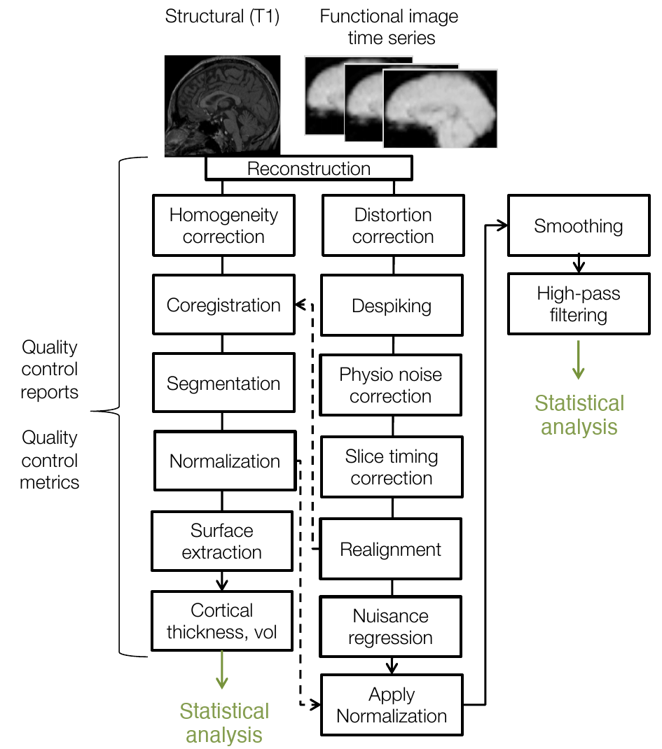
An fMRI preprocessing pipeline, including structural (T1) and functional processing sequences. Dashed lines show dependencies across streams — for example, normalization parameters estimated from the T1 are applied to the functional images. (Figure 24.1 from the book. © the authors and MIT Press; reproduced with permission — not covered by this site’s CC-BY license.)
Pipelines vary in which steps are included, the software used for each step, the parameters chosen, and — crucially — the order of operations. Most operations are not commutative, so order changes results: high-pass filtering after motion correction can reintroduce motion artifacts, while motion correction after filtering can reintroduce low-frequency signals, unless care is taken to prevent both. And in many cases there is no single best order — groups still disagree about whether slice-timing correction should precede or follow realignment (or be done at all), because the two steps are interdependent and either ordering creates its own problems. Resting-state and task pipelines also diverge in temporal preprocessing: bandpass filtering, CompCor, and sometimes global signal regression are common for resting-state data, while task studies more often apply spatial smoothing (especially when random field theory will be used later). In practice, steps are often chosen for availability and ease of use, on the implicit assumption that results are robust to these choices. That assumption is worth questioning — particularly when studying populations other than young healthy adults.
How much do these choices matter? Carp took a single response-inhibition dataset and analyzed it under combinations of common preprocessing and modeling options — despiking, slice timing, three normalization schemes, three smoothing kernels, filtering, autocorrelation correction, run concatenation, three basis sets, several motion-regression schemes, and five thresholding approaches. The combinations yielded 34,560 unique pipelines and as many thresholded activation maps. Results showed both consistency and variability: many pipelines activated the same general regions, but peak locations scattered widely within them, some regions were far more pipeline-sensitive than others, and extra activation appeared across much of the brain. Because published papers often under-describe their pipelines, no one knows how many distinct pipelines exist in the literature — but it is far more than Carp explored.
The NARPS study (Botvinik-Nezer and colleagues) tested this “in the wild”: 70 independent research teams analyzed the same decision-making dataset and tested the same a priori hypotheses. For the well-established hypothesis of a positive parametric effect of monetary gain in vmPFC, only 37.1% of teams reported a significant result. Encouragingly, the underlying unthresholded statistical patterns were far more stable across teams than the thresholded conclusions — pointing to stringently thresholded maps as a central culprit. Larger samples help but are not always feasible; multivariate pattern-based approaches (Chapters 37–40) offer another path, using the whole spatial pattern for estimation and prediction rather than thresholded tests of individual voxels. Related work by Marek and colleagues found that multivariate methods captured about four times more individual-difference variance in psychological outcomes than univariate methods. Even holding the pipeline fixed does not eliminate variability: Bowring and colleagues re-analyzed the same studies in AFNI, FSL, and SPM and found that strongly activated areas agreed, but the non-extreme values — and hence the thresholded maps — differed clearly, and even the operating system can nudge results.
This analytic flexibility is an instance of researcher degrees of freedom — the garden of forking paths that runs through every scientific discipline. When researchers can explore many pipelines and report only the one that “worked,” each fork adds unacknowledged multiplicity: false positive rates inflate well beyond the nominal level, and results become dependent on undisclosed methodological decisions. The danger is not fraud but ordinary selective reporting — trying variants until the story is clean, then describing only the final analysis.
These challenges have driven the field toward standardization. Tools like nibabel (image format conversion) and nipype (chaining tools across packages and languages) let pipelines “speak the same language,” and modern shared pipelines like fMRIPrep combine well-tested algorithms from FSL, ANTs, FreeSurfer, and AFNI into a robust, portable workflow. Large consortia — UK Biobank, ABCD, HCP, ENIGMA — publish reusable pipelines of their own. The Brain Imaging Data Structure (BIDS) standardizes file names, folder hierarchies, and metadata so that “BIDS apps” run on almost any dataset, and compute containers (Docker, Singularity) package software with its operating system so a pipeline runs identically anywhere. Beyond efficiency, these tools bring battle-testing by large user communities, high-quality visual QC reports, and standardized derivatives that can be shared in open repositories such as OpenNeuro. Best practice ties it together: verify that a standardized pipeline suits your images and population; fix the pipeline before seeing the results (preregistration), clearly labeling any exploratory deviations; validate findings on independent data when possible; share data, code, and unthresholded statistical maps; and describe the pipeline completely, following reporting guidelines such as the OHBM COBIDAS report.
Hands-on tutorial
In this tutorial you will run a mini-multiverse analysis: one simulated study — 24 subjects with a real task effect, plus drift, autocorrelated noise, and motion-like spikes — analyzed through a factorial grid of defensible pipeline choices (high-pass cutoff × smoothing × outlier handling × autocorrelation correction, 3 × 3 × 2 × 2 = 36 variants). The full labs build every pipeline component from scratch; here are the two key steps.
Step 1 — Run the same data through every pipeline variant. Each variant fits a first-level GLM per subject and carries the task beta at an a priori voxel to a group one-sample t-test. (The helper that applies one pipeline variant to one subject — filtering, smoothing, spike regressors, AR(1) prewhitening — is built step by step in the full labs.)
Each first-level fit is the GLM of Chapter 18, with noise the pipeline may or may not model:
y — voxel time series · X — design matrix (task, intercept, optional drift + spike regressors) · β — regression coefficients · ε — noise · φ — lag-1 autocorrelation · uₜ — white innovation at time t
where is one voxel’s time series, the first-level design matrix (task regressor, intercept, and — depending on the variant — drift and spike regressors), the coefficient vector, and AR(1) noise with lag-1 autocorrelation (here ), driven by white innovations .
The estimated task beta at the a priori voxel then goes into a group one-sample t-test:
t — group t-statistic · β̂_task — subjects’ task betas at the a priori voxel · s_β̂ — standard deviation of the betas across subjects · n — number of subjects (24)
where is the mean of the subjects’ estimated task betas, their standard deviation across subjects, and the number of subjects. Every pipeline variant changes and the fitting procedure — and therefore the betas — while the data stay identical.
% Requires CanlabCore + SPM12 (onsets2fmridesign for the task regressor)
% Adapted from CANlab tutorials (github.com/canlab)
hp_opts      = [Inf 128 64];    % high-pass cutoffs (s); Inf = no filtering
fwhm_opts    = [0 4 8];         % smoothing FWHM (mm)
despike_opts = [false true];    % spike regressors?
ar1_opts     = [false true];    % AR(1) prewhitening?

results = table();              % one row per pipeline variant
for hp = hp_opts
  for fwhm = fwhm_opts
    for despike = despike_opts
      for ar1 = ar1_opts
        betas = zeros(n_sub, 1);   % task beta at the a priori voxel, per subject
        for s = 1:n_sub    % one subject through one pipeline variant
            betas(s) = first_level_beta(squeeze(data(s,:,:)), task, ...
                TR, hp, fwhm, vox_mm, despike, ar1, peak_vox);
        end
        [~, p, ~, st] = ttest(betas);   % group one-sample t-test
        results = [results; {hp, fwhm, despike, ar1, ...
            mean(betas), std(betas)/sqrt(n_sub), st.tstat, p, p < 0.05}];
      end
    end
  end
end
fprintf('%d variants; %d significant at p < .05\n', ...
    height(results), sum(results.significant));
import itertools
import numpy as np, pandas as pd
from scipy import stats
hp_opts = [None, 128, 64] # high-pass cutoffs (s); None = no filtering
fwhm_opts = [0, 4, 8] # smoothing FWHM (mm); 0 = none
despike_opts = [False, True] # spike regressors?
ar1_opts = [False, True] # AR(1) prewhitening?
rows = [] # one result dict per pipeline variant
for hp, fwhm, despike, ar1 in itertools.product(
hp_opts, fwhm_opts, despike_opts, ar1_opts):
betas = np.array([ # one subject through one pipeline variant
first_level_roi_beta(data[s], hp, fwhm, despike, ar1)
for s in range(n_sub)])
t, p = stats.ttest_1samp(betas, 0) # group one-sample t-test
rows.append(dict(hp=hp, fwhm=fwhm, despike=despike, ar1=ar1,
mean_beta=betas.mean(),
sem=betas.std(ddof=1) / np.sqrt(n_sub),
t=t, p=p, significant=p < 0.05))
results = pd.DataFrame(rows)
print(f"{len(results)} variants; "
f"{results['significant'].sum()} significant at p < .05")Example output:
36 pipeline variants; 9 significant at p < .05 (25%)
group t range: 0.79 to 3.00
In the labs, this same real effect comes out significant in only 9 of 36 variants (25%), with group t-statistics ranging from 0.79 to 3.00 — a one-dataset echo of NARPS.
Step 2 — Draw a specification curve. Order all 36 estimates from smallest to largest with confidence intervals (top panel), and mark below each one which option every factor took (bottom panel). Choices whose marks cluster at one end matter; choices spread evenly barely move the result.
[~, order] = sort(results.mean_beta);   % order variants by estimated effect
res = results(order, :);  xx = 1:height(res);  sig = res.significant;

create_figure('specification curve', 2, 1);
subplot(2,1,1);
errorbar(xx, res.mean_beta, 1.96*res.sem, 'LineStyle','none', ...
    'Color', [.8 .8 .8]); hold on;
scatter(xx(sig),  res.mean_beta(sig),  30, 'r', 'filled');
scatter(xx(~sig), res.mean_beta(~sig), 30, [.5 .5 .5], 'filled');
plot(xlim, [0 0], 'k-');
ylabel('group mean beta (95% CI)');

spec_masks = [res.hp==Inf, res.hp==128, res.hp==64, res.fwhm==0, ...   % one column per factor option
    res.fwhm==4, res.fwhm==8, ~res.despike, res.despike, ~res.ar1, res.ar1];
subplot(2,1,2); hold on;
for i = 1:size(spec_masks, 2)
    m = spec_masks(:, i);
    scatter(xx(m), repmat(11 - i, sum(m), 1), 14, 'ks', 'filled');
end
xlabel('pipeline variants, ordered by estimated effect');
import matplotlib.pyplot as plt
res = results.sort_values("mean_beta").reset_index(drop=True)
x = np.arange(len(res))
sig_col = np.where(res["significant"], "crimson", "gray") # red = significant
fig, (ax1, ax2) = plt.subplots(2, 1, figsize=(9, 6), sharex=True,
height_ratios=[2, 1.4])
ax1.errorbar(x, res["mean_beta"], 1.96 * res["sem"],
fmt="none", ecolor="lightgray")
ax1.scatter(x, res["mean_beta"], c=sig_col, s=28, zorder=3)
ax1.axhline(0, color="k", lw=0.8)
ax1.set_ylabel("group mean beta (95% CI)")
spec_rows = [(f"{f}: {v}", res[f] == v) # one row per option
for f in ["hp", "fwhm", "despike", "ar1"]
for v in res[f].unique()]
for i, (label, mask) in enumerate(spec_rows):
ax2.scatter(x[mask], np.full(mask.sum(), len(spec_rows) - i),
marker="s", s=14, color="k")
ax2.set_yticks(range(1, len(spec_rows) + 1),
[lab for lab, _ in reversed(spec_rows)], fontsize=8)
ax2.set_xlabel("pipeline variants, ordered by estimated effect")Example output:
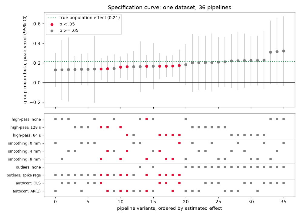
Specification curve across all 36 pipeline variants. Red points are significant at , where is the two-sided group t-test p-value; the dotted green line marks the true simulated population effect.
Read the bottom panel row by row: spike-regressor and 64-s high-pass marks cluster among the significant variants at the middle of the curve (tighter estimates, larger t), the no-filtering marks pile up at both extremes, and the AR(1)/OLS rows are spread almost evenly — that choice barely matters here.
The full labs complete the arc: simulating the study from scratch, building each pipeline component (DCT drift regressors, Gaussian smoothing, robust spike detection, AR(1) prewhitening), plotting the “vibration of effects” histogram, and quantifying which analytic choices actually drive the spread — plus exercises that let you experience how easy it is to “find” an effect by shopping across pipelines.
Open the full Python lab notebook → or download the MATLAB live script, which mirrors it using CANlab tools.


Thought questions
NARPS found that thresholded conclusions varied wildly across 70 teams while unthresholded statistical patterns were much more stable. What does this dissociation imply about where in the analysis chain the reproducibility problem lives — and how should it change what researchers report, share, and treat as a study’s primary result?
Standardized pipelines like fMRIPrep reduce analytic flexibility, but the chapter warns that pipeline steps interact with image and population characteristics (scanner vendor, acquisition, children vs. adults). Construct the strongest argument against universal adoption of a single standardized pipeline, and then describe the checks you would run before trusting fMRIPrep defaults on a pediatric clinical sample.
Preregistration and multiverse-style reporting attack the forking-paths problem from opposite directions — one constrains choices in advance, the other reports all of them. For a study of a novel population where you genuinely do not know which preprocessing choices are appropriate, how would you combine the two, and what would you commit to before seeing any results?
High-pass filtering after motion correction can reintroduce motion artifacts, and motion correction after filtering can reintroduce low-frequency signals; slice timing and realignment are similarly interdependent. Why can’t such ordering dilemmas be resolved by simply testing which order “gives better results” on your own data? What would a principled resolution look like?
In the lab’s multiverse, spike handling flipped half the variants from non-significant to significant even though the simulated effect was real. A skeptic says this proves despiking is a form of p-hacking; a defender says it proves despiking is necessary. Adjudicate: what distinguishes a pipeline choice that recovers a true effect from one that manufactures an apparent one, and what evidence could tell them apart?
Quiz yourself
Q1. What is an fMRI analysis pipeline, and what are the two broad classes of preprocessing operations it combines?
Answer: A pipeline is a reproducible sequence of processing operations, often drawn from multiple software tools, that turns raw images into analysis-ready data and results. It combines spatial operations (e.g., distortion correction, segmentation, normalization) with temporal operations (e.g., high-pass filtering, nuisance regression).
Q2. Give one example of a dependency between the structural and functional processing streams.
Answer: The structural T1 image is coregistered with the subject’s functional images, and the normalization parameters estimated from the higher-resolution T1 are then applied to warp the functional images to the population template.
Q3. Why does the order of preprocessing operations matter? Give a concrete example.
Answer: Most operations are not commutative, so their order changes the result. For example, high-pass filtering after motion correction can reintroduce motion artifacts into the data, while motion correction after high-pass filtering can reintroduce low-frequency signals, unless specific care is taken to prevent these effects.
Q4. What did Carp’s study of pipeline variability do, and what did it find?
Answer: Carp analyzed one response-inhibition dataset under combinations of common preprocessing and modeling choices, yielding 34,560 unique pipelines and thresholded maps. Many pipelines activated the same general regions, but peak locations scattered widely within them, some regions were much more pipeline-sensitive than others, and additional activation appeared across much of the brain.
Q5. In the NARPS study, what fraction of the 70 teams found the vmPFC monetary-gain effect significant, and what was the encouraging counterpoint?
Answer: Only 37.1% of teams reported the hypothesized vmPFC effect as significant. Encouragingly, the underlying unthresholded spatial patterns of statistic values were much more stable across teams — implicating stringent thresholding of statistic maps, rather than the underlying estimates, as a central source of divergent conclusions.
Q6. What are “researcher degrees of freedom,” and why does exploring many pipelines but reporting one inflate false positive rates?
Answer: Researcher degrees of freedom are the many undisclosed choices available in defining outcomes and analyses. Trying multiple pipelines and reporting only the one that gives the best result is an unacknowledged multiple-comparison problem: each explored variant is another chance for a false positive, but the reported p-value pretends only one analysis was run, inflating false positives and producing irreproducible findings.
Q7. Name the roles played by BIDS, fMRIPrep, and compute containers in improving reproducibility.
Answer: BIDS standardizes file names, folder structure, and metadata so tools can run on any conforming dataset. fMRIPrep is a standardized preprocessing pipeline combining well-tested components from FSL, ANTs, FreeSurfer, and AFNI, reducing analytic flexibility and producing QC reports and standard derivatives. Containers (Docker/Singularity) package the software with its operating system so the same pipeline runs identically on different computer architectures.
Q8. Even with a fixed pipeline specification, what did Bowring and colleagues show about software choice?
Answer: Analyzing the same studies in AFNI, FSL, and SPM produced broadly similar results in strongly activated areas, but clear differences in the thresholded maps, with substantial variation in the non-extreme statistic values — showing that implementation, software package, and even operating system contribute to result variability.
 The book: Elements of Functional Magnetic Resonance Imaging — Wager & Lindquist, MIT Press